A launch campaign and product visuals for a premium sunglasses brand, from identity to ads and packaging.
- Project
- Vector 01 · Built to Be Seen
- Category
- Brand Campaigns
- Overview
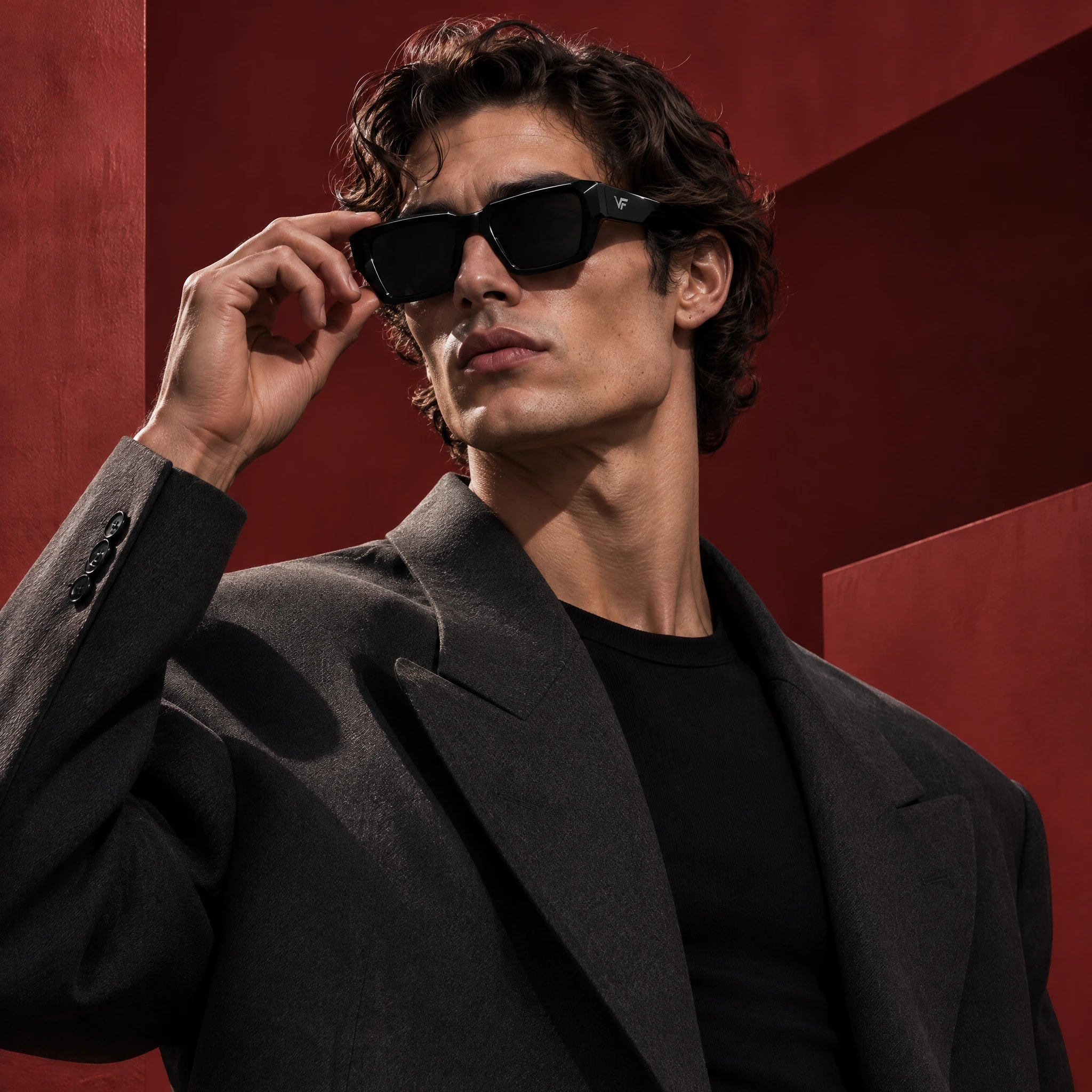
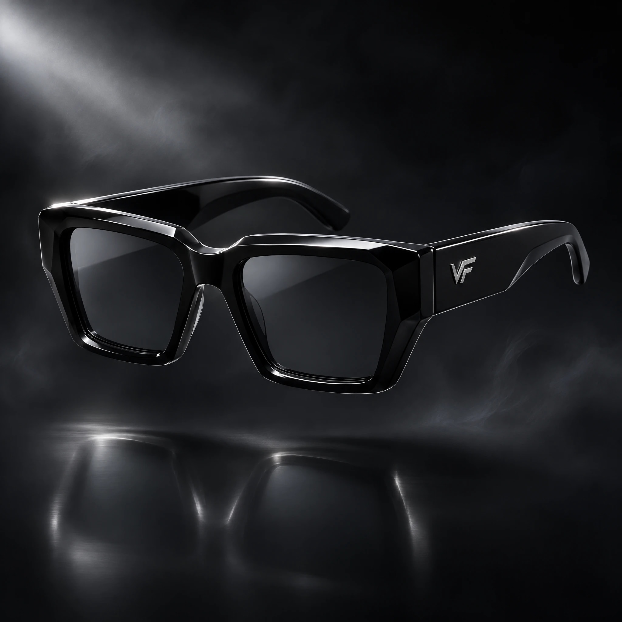
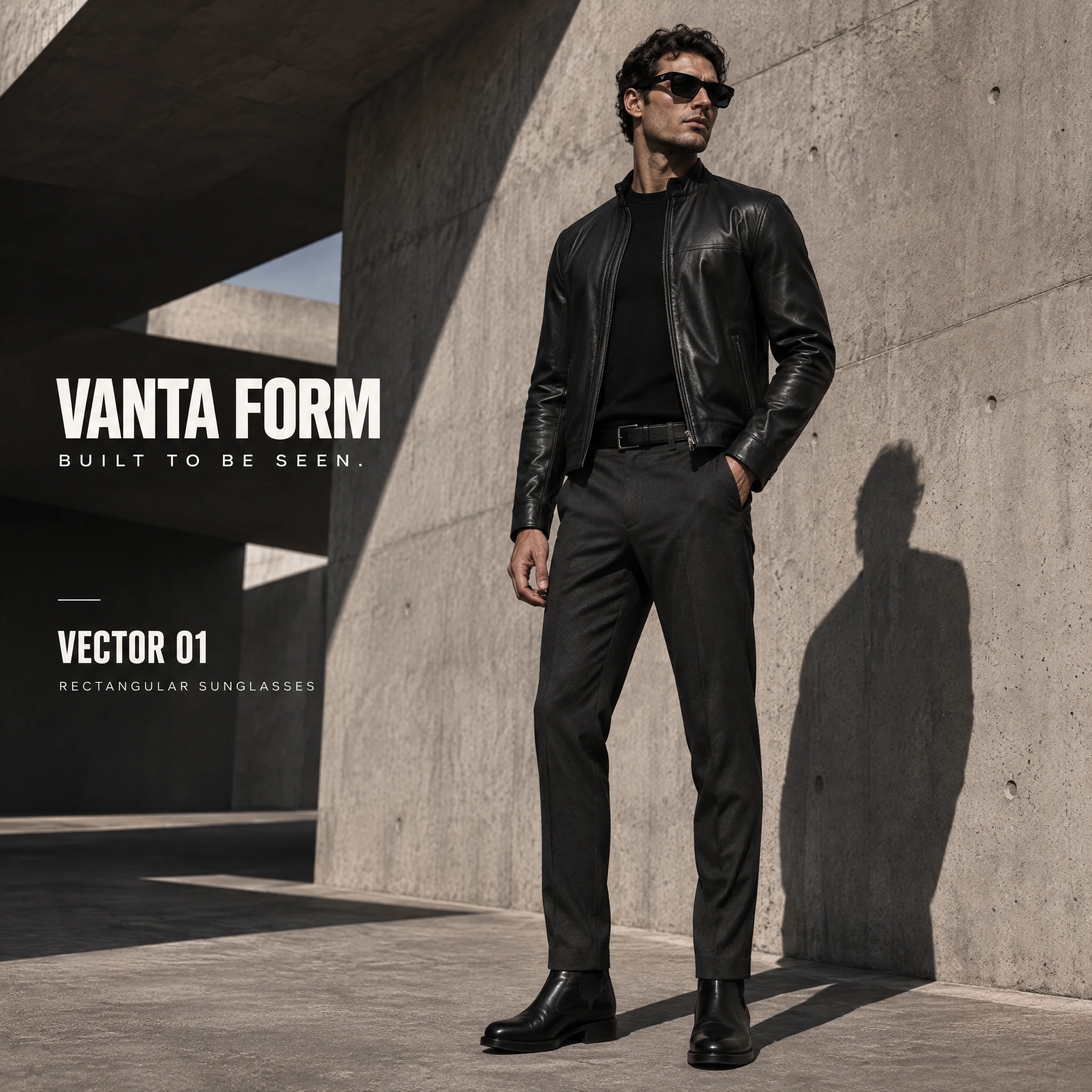
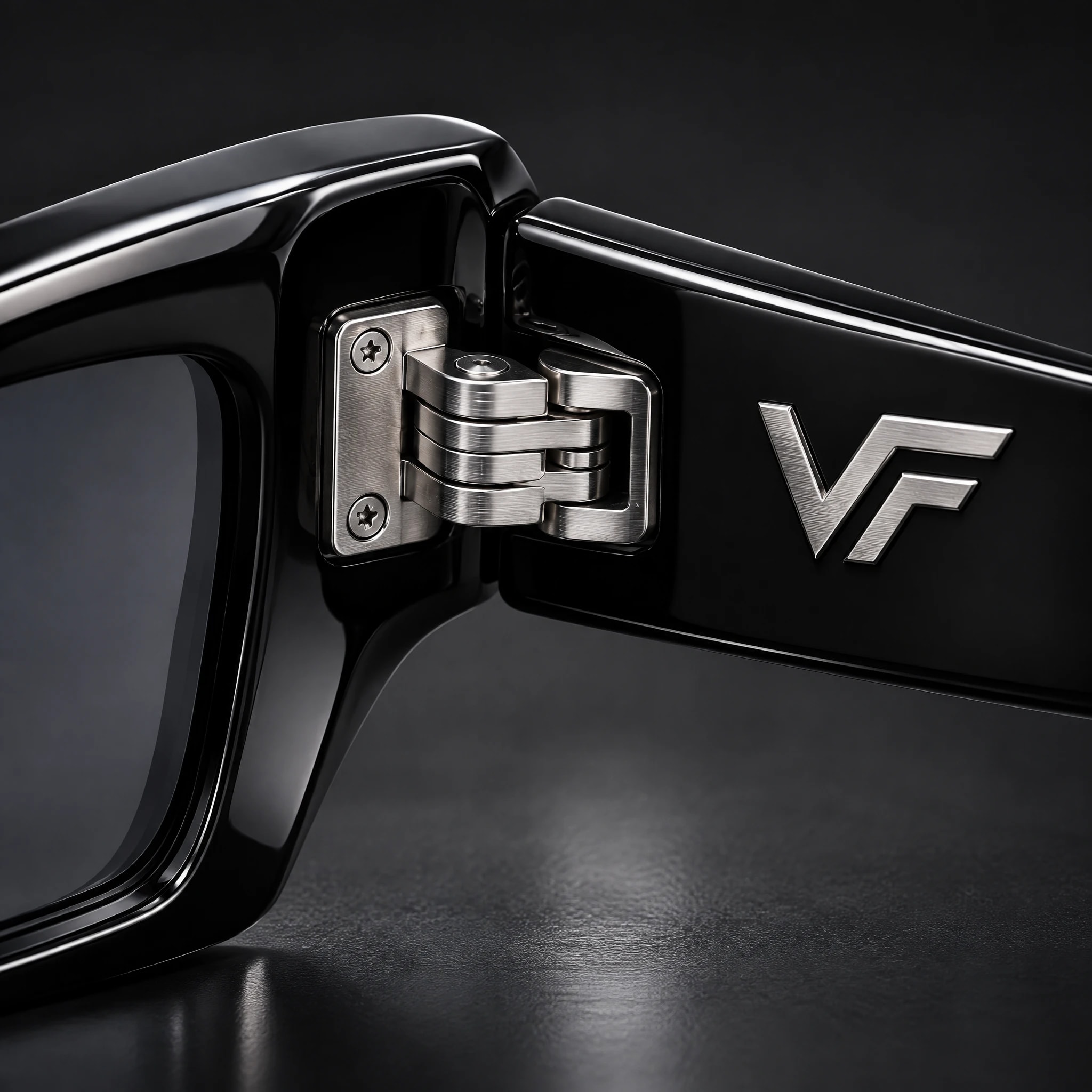
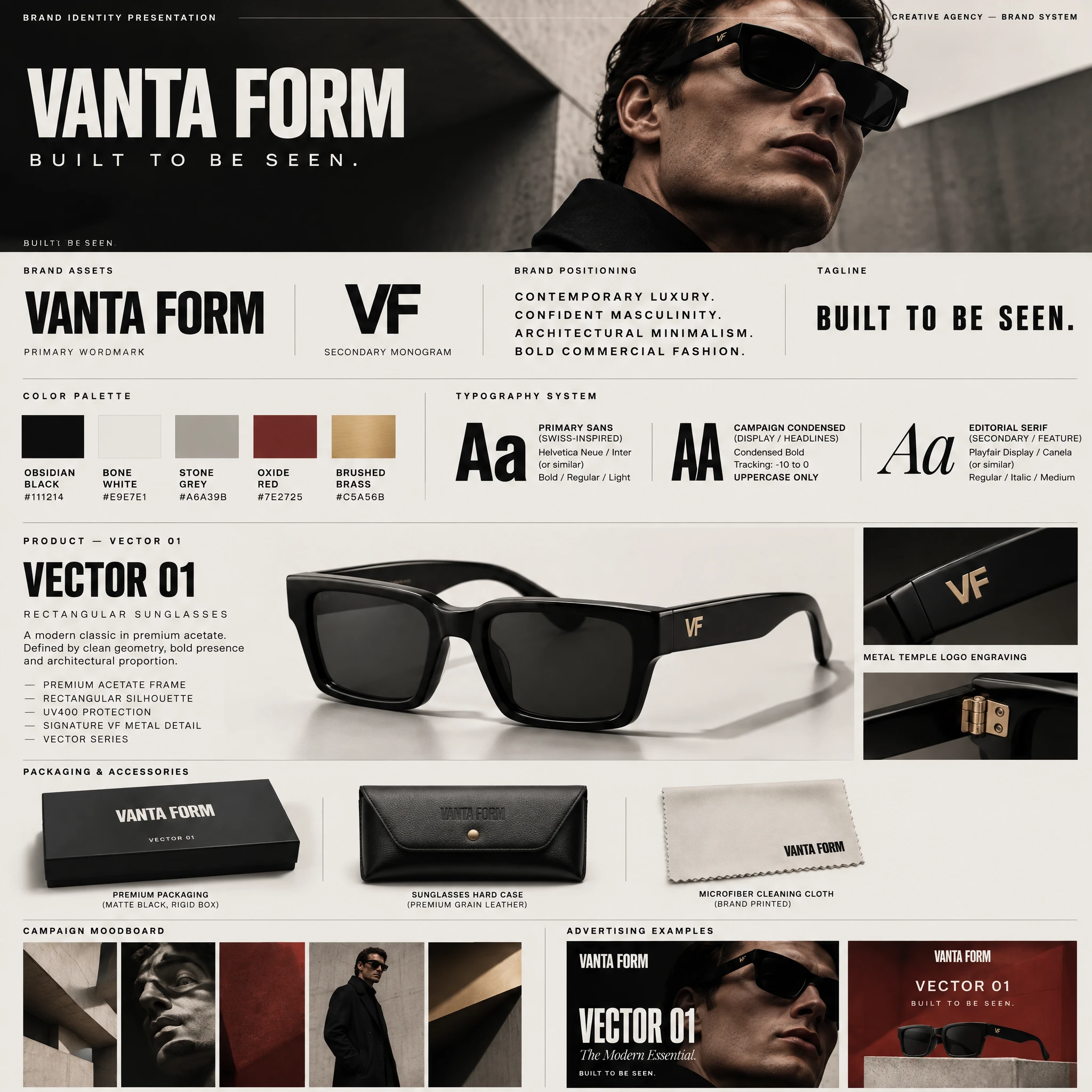
- Vanta Form is a fictional eyewear brand we created to show a complete campaign for a fashion product. The launch product is Vector 01, a rectangular black acetate sunglass with a signature VF metal detail. We made the brand identity, the campaign idea, campaign photography, product visuals and the packaging, all as one system.
- Challenge
- Sunglasses ads all look alike: a model, a pair of glasses, a sunny backdrop. A new brand needed a look that feels premium and its own, while keeping the product the first thing people see.
- Concept
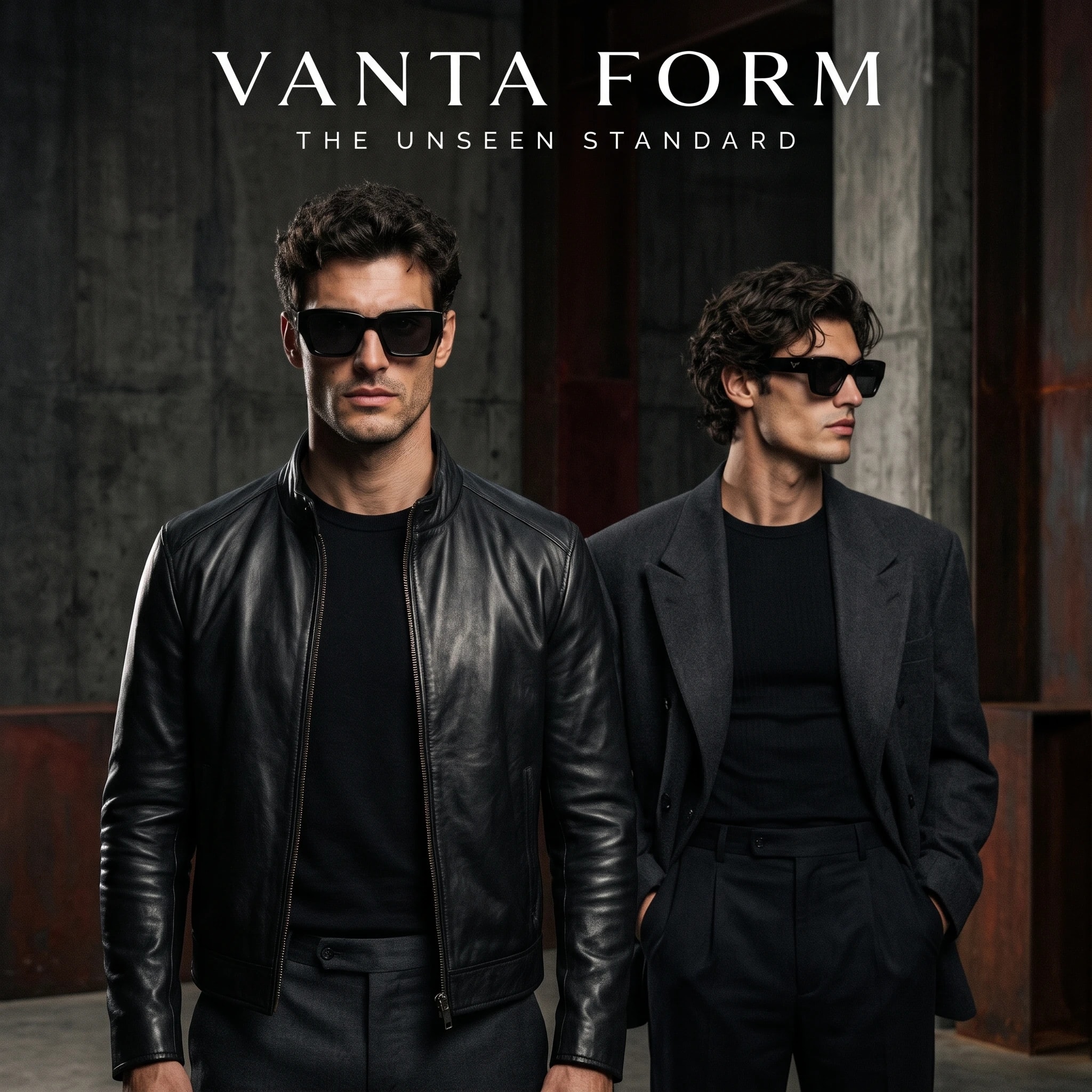
- Built to Be Seen: contemporary luxury and confident masculinity in an architectural world of raw concrete, obsidian black and one hit of oxide red, with brushed brass for the details. The frames are always the sharpest point in the picture.
- Approach
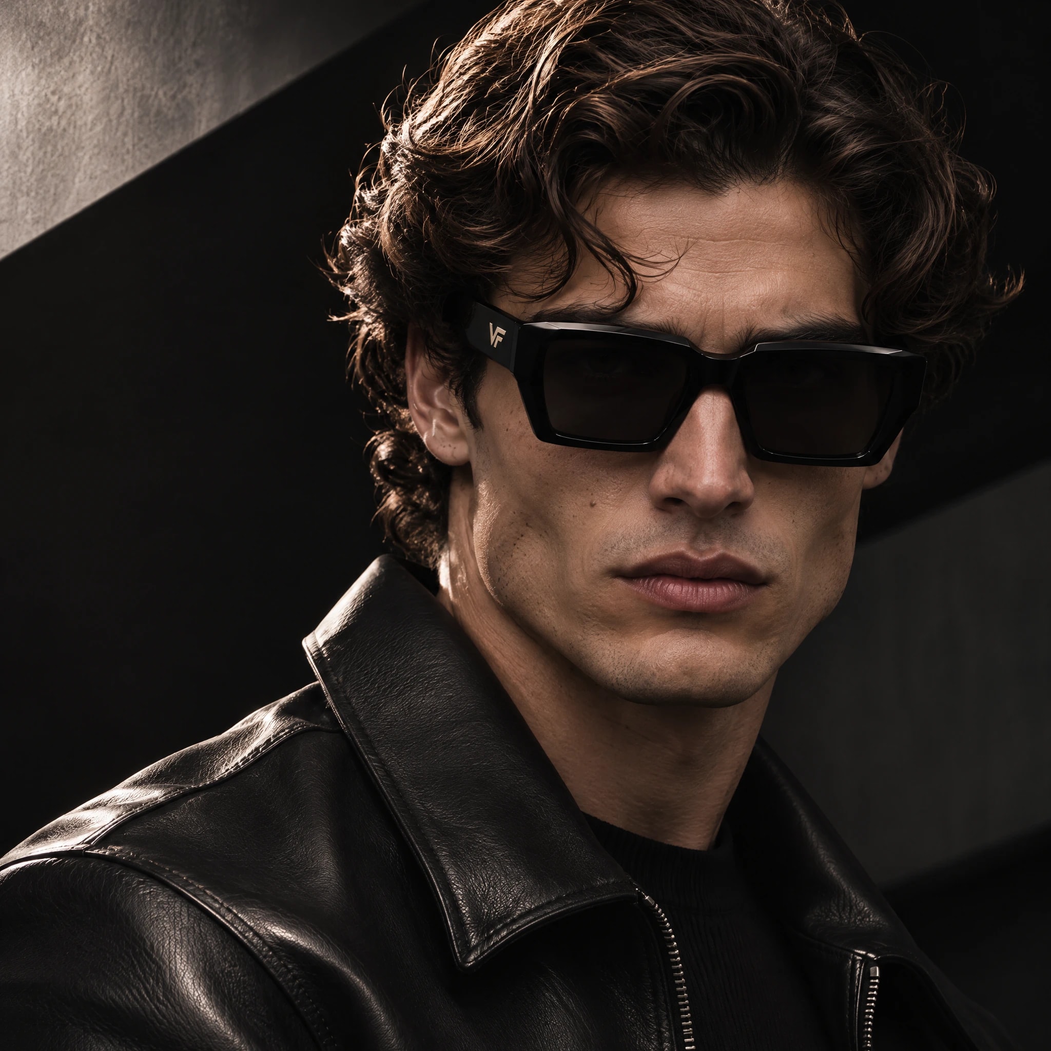
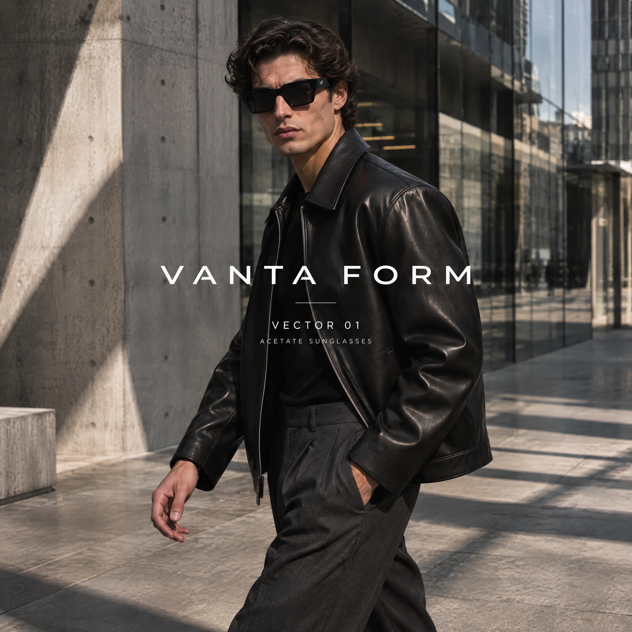
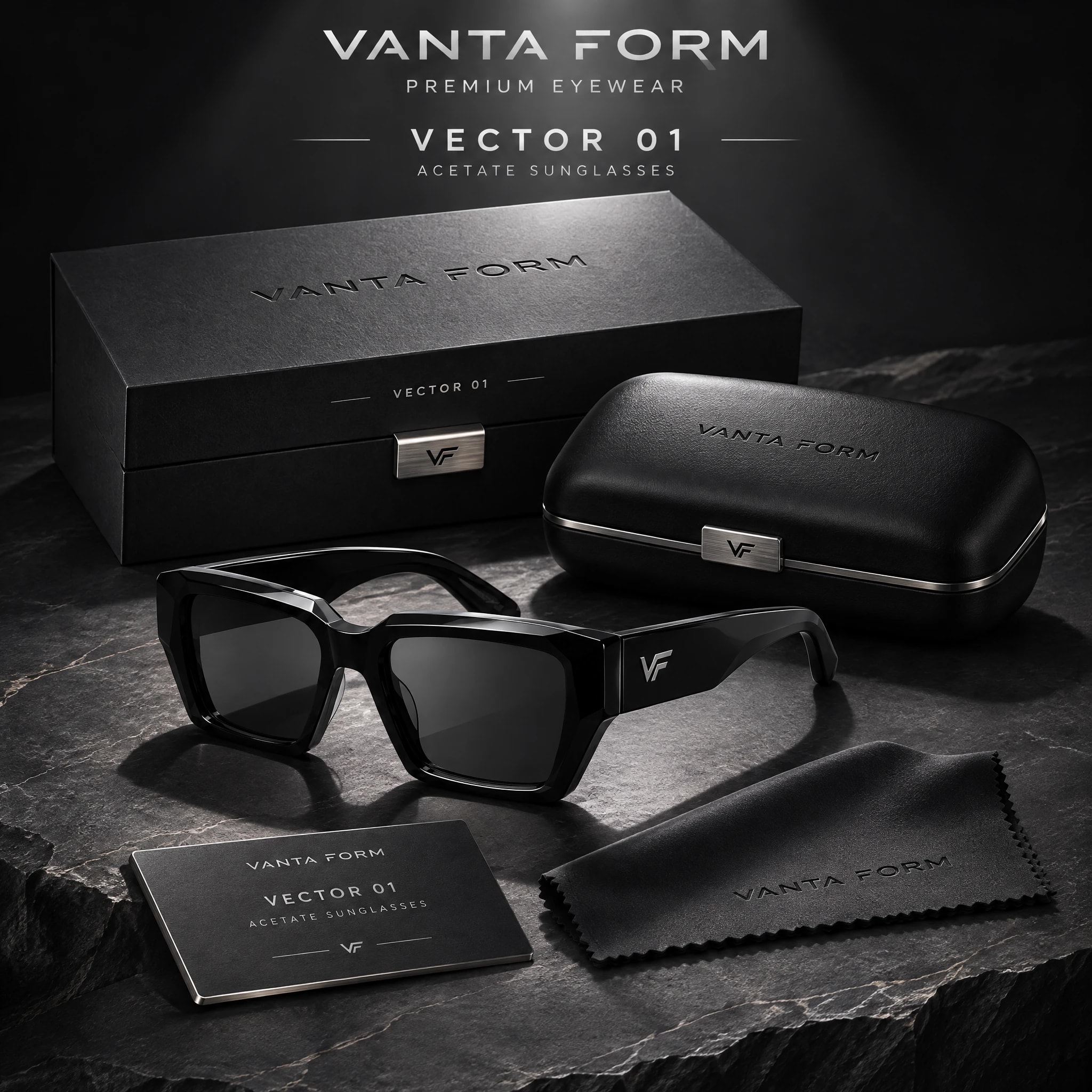
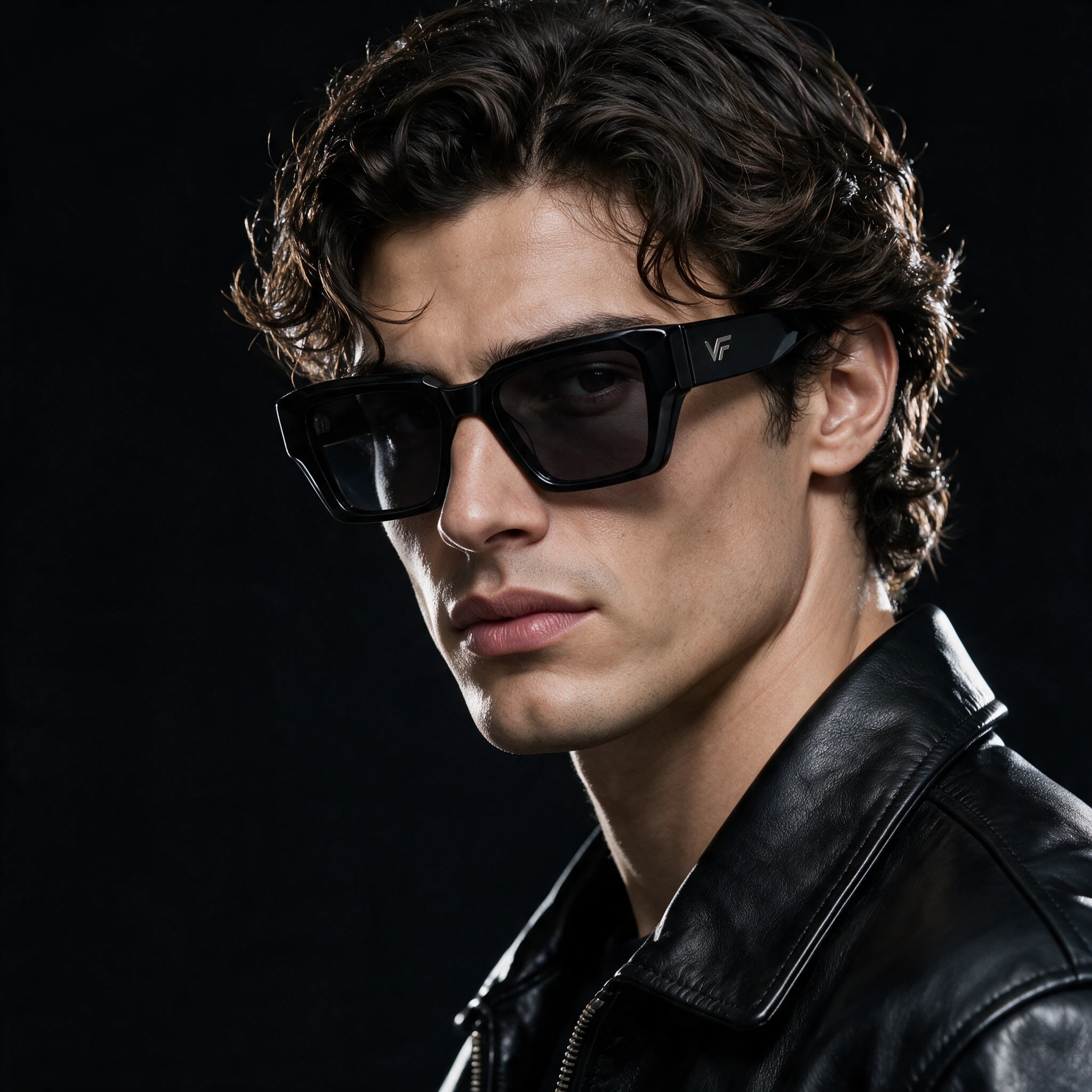
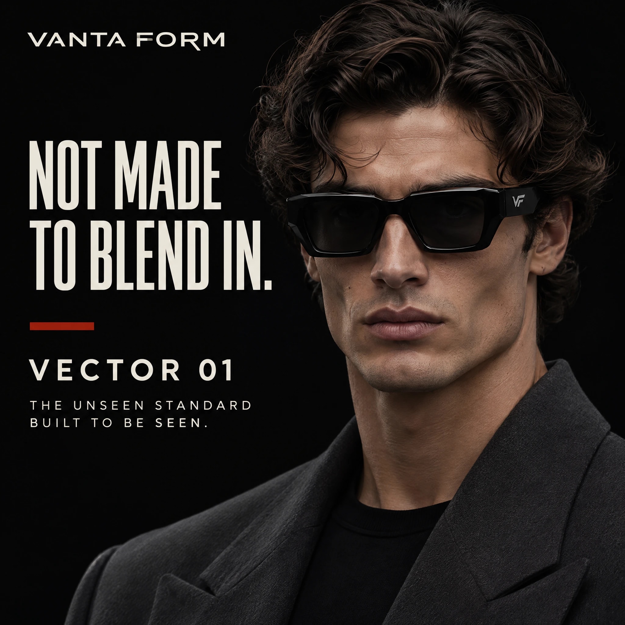
- We started with a design sheet: the wordmark and VF monogram, a five-colour palette from Obsidian Black to Brushed Brass, a Swiss-style sans with a condensed campaign face and an editorial serif. From there we made campaign portraits, street and studio scenes, product hero shots, macro details and packaging, then ad layouts like "Not made to blend in". The visuals were made with AI image tools under our creative direction, then checked with attention tests.
- Deliverables
- Brand identity and VF monogram
- Campaign concept: Built to Be Seen
- Campaign photography
- Product hero and detail visuals
- Packaging visual
- Ad layouts
- Design sheet and usage rules
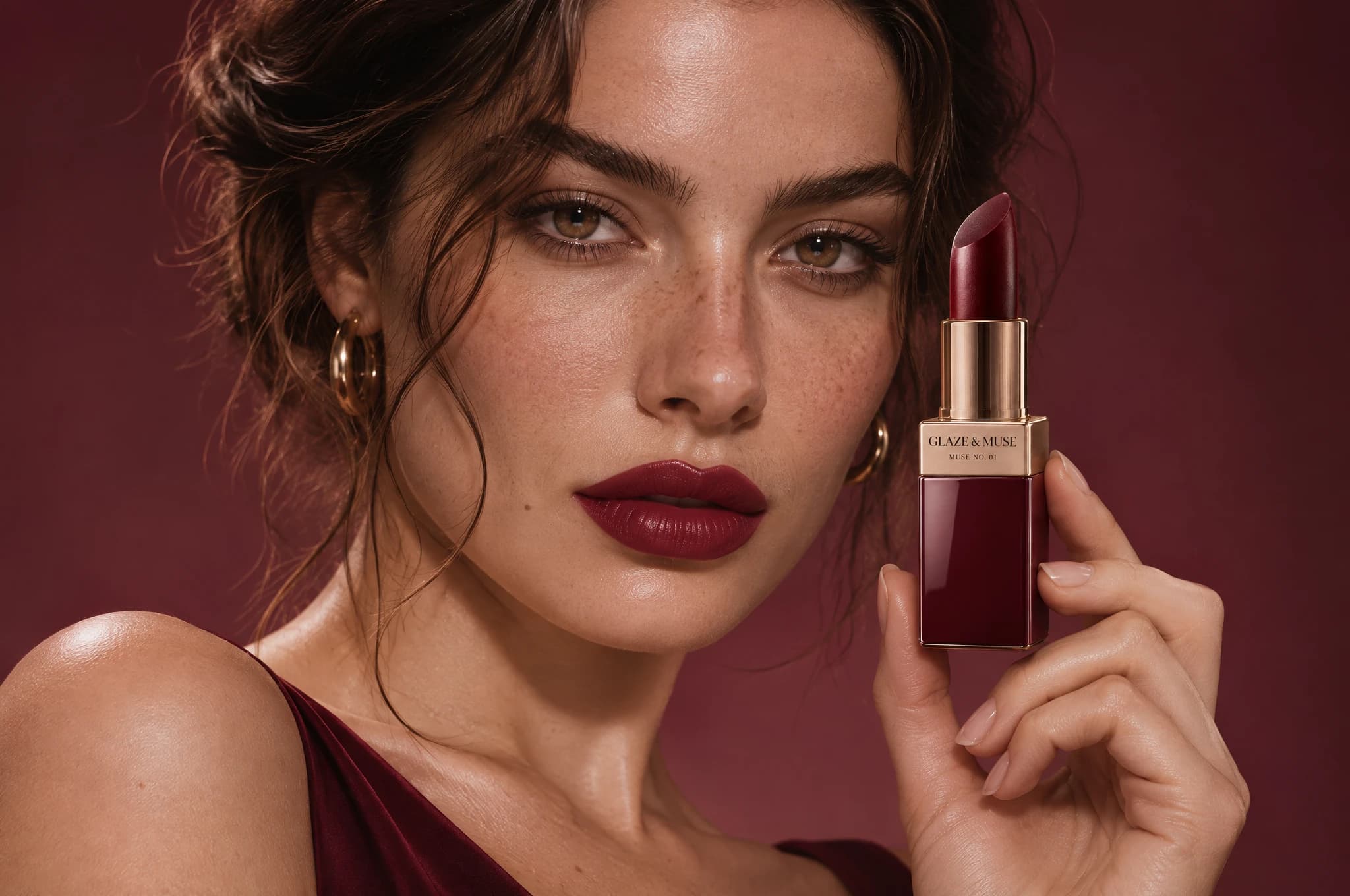
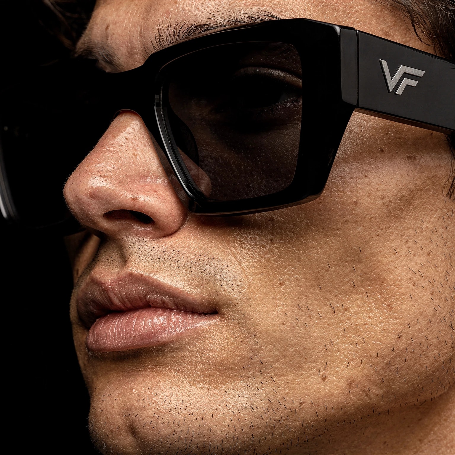
12 visuals, one idea.
Product, portraits, packaging and detail shots, all built from the same palette, light and typography so the campaign is recognisable at a glance.
The rules behind every visual.
Before any image was made, we wrote the identity down: logo, colour, type and usage rules. That is what keeps a campaign consistent across every channel.
- Typeface
Helvetica Neue (Swiss sans)
Wordmark, headlines and body
- Typeface
Condensed campaign sans
Display headlines, uppercase
- Typeface
Playfair Display
Editorial accents
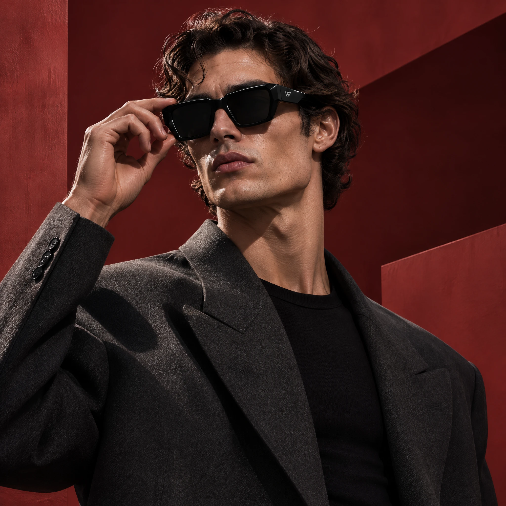
How this visual is built to get seen first.
Where a project needs it, we check key visuals with these six attention checks. Here they are on this concept project.
Heat map
Where eyes land in the first seconds: sunglasses, then face, then hand.
123Gaze order
What people see 1st, 2nd and 3rd, in the order we planned.
1 clear focusClarity score
One clear focus, not five fighting ones. Here: the sunglasses.
Blur test
Blurred down, the sunglasses still stands out.
Thumb-stop test
Shrunk to phone-feed size, it still reads and stops the scroll.
5s“Bold black sunglasses for people who want to be noticed.”Five-second test
After five seconds, people know what it's for: "Bold black sunglasses for people who want to be noticed."
Sample analysis to show the method. On client projects we run these checks with attention-prediction tools before anything goes live.