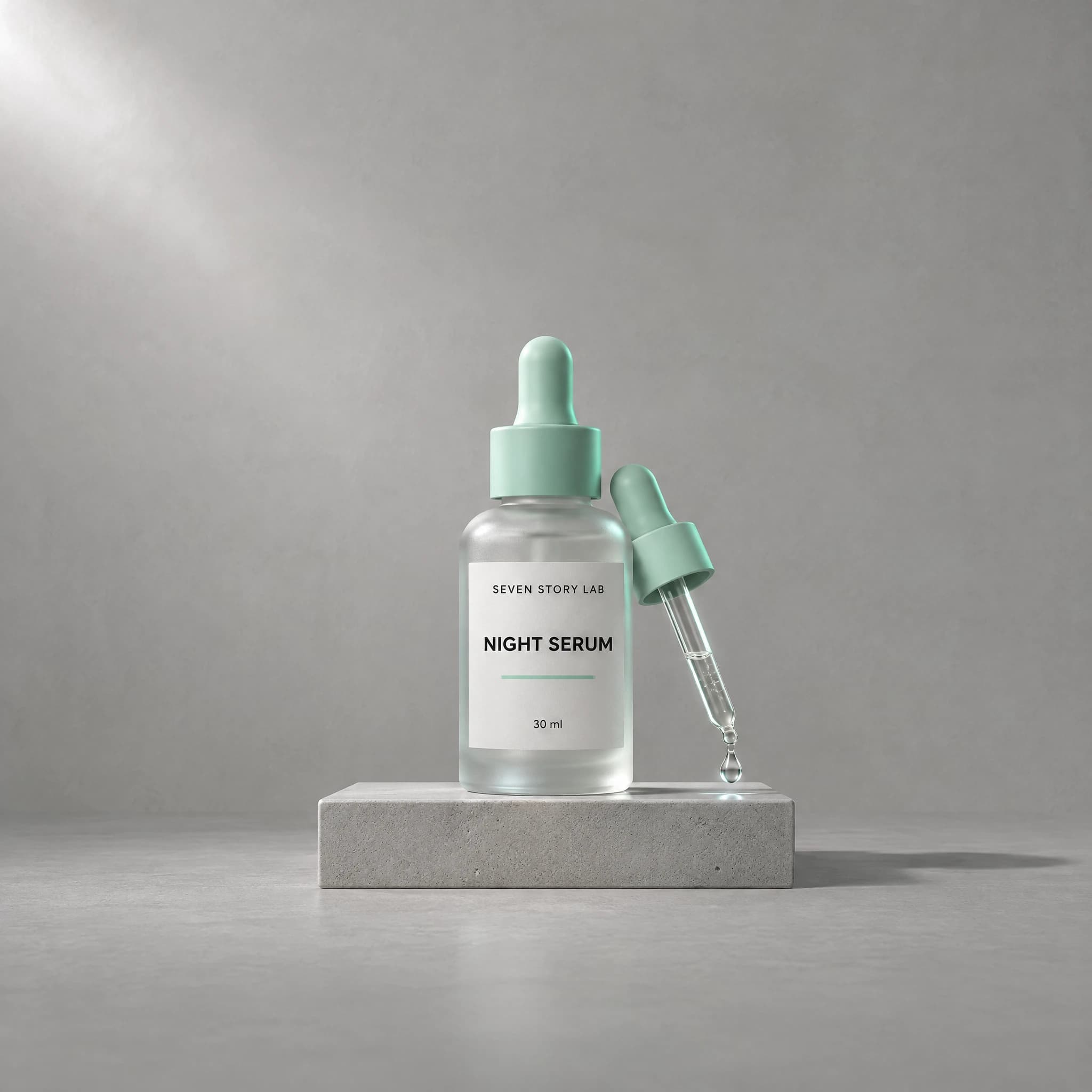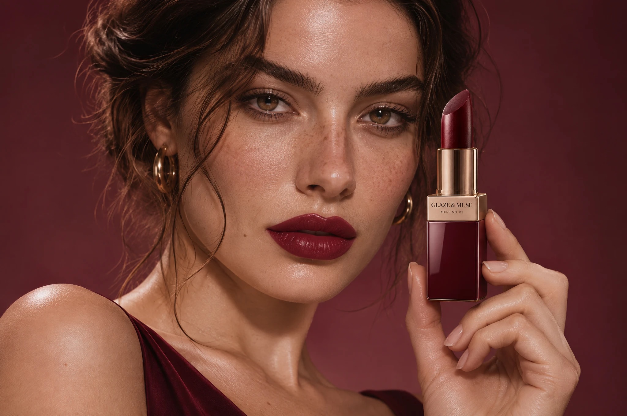
A full launch campaign for a beauty brand's first lipstick, from identity to portraits and packaging.
- Project
- Muse No. 01 · The First Muse
- Category
- Brand Campaigns
- Overview
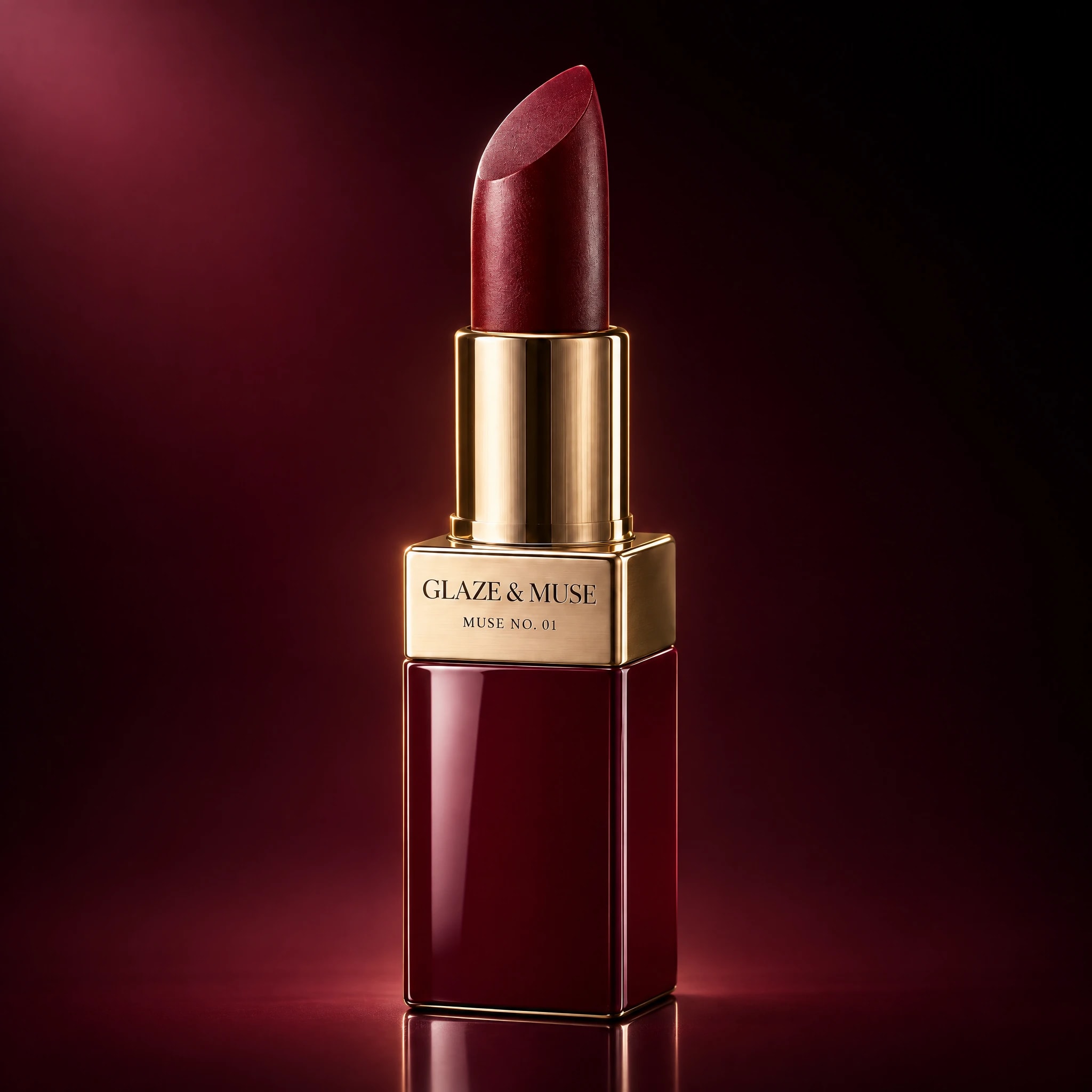
- Glaze & Muse is a fictional beauty brand we created to show a complete brand campaign built from nothing. The launch product is Muse No. 01, a burgundy lipstick in a brushed-gold case. We made the brand identity, the campaign idea and twelve campaign visuals that work together as one system.
- Challenge
- A new beauty brand has no name recognition, and a launch lives or dies in the first seconds of a feed. The campaign needed a look that is instantly its own, with the product noticed before anything else.
- Concept
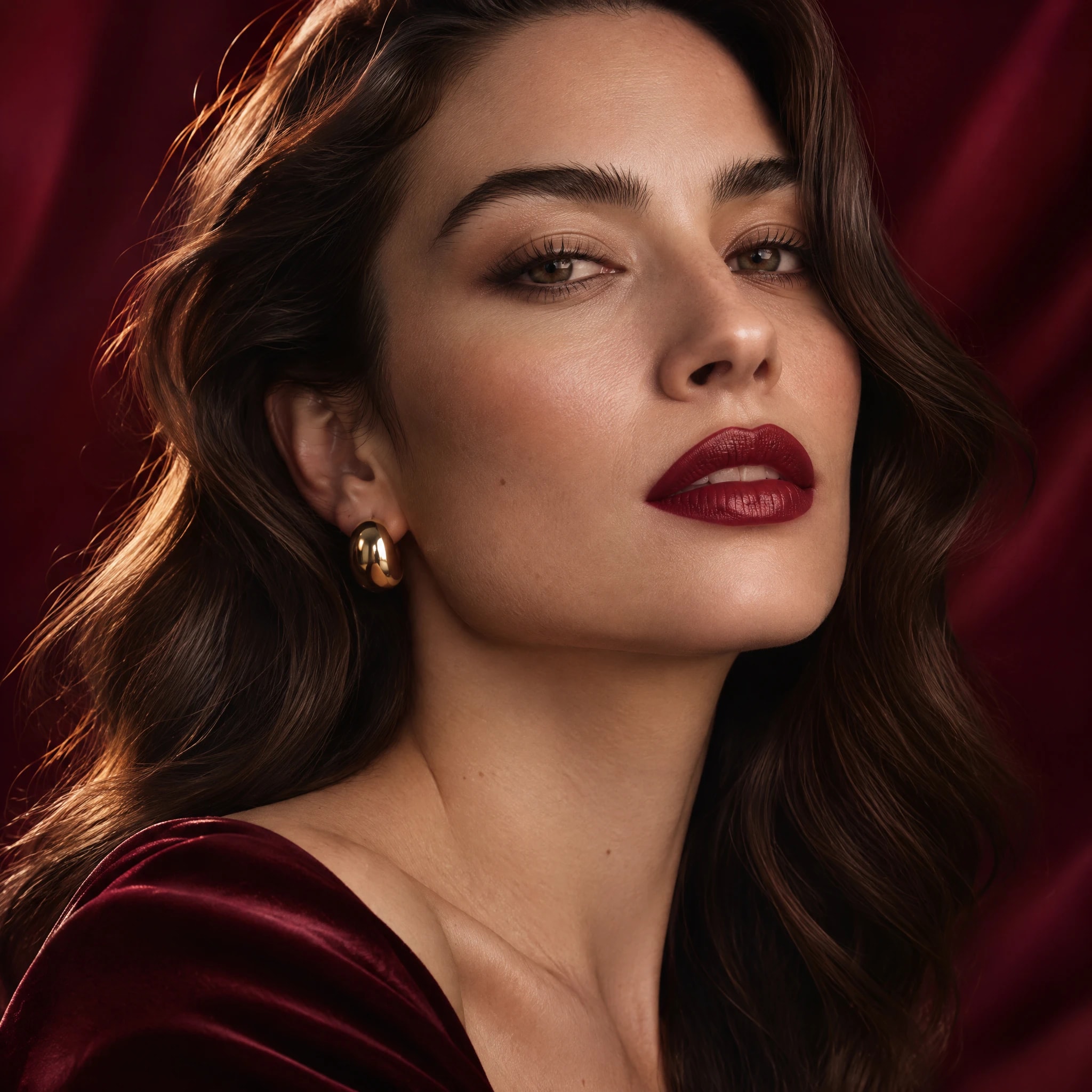
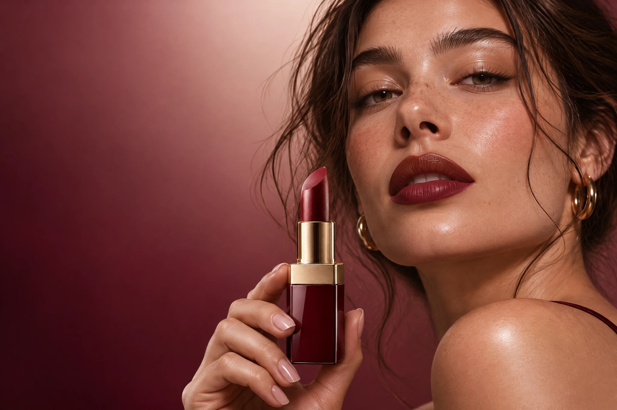
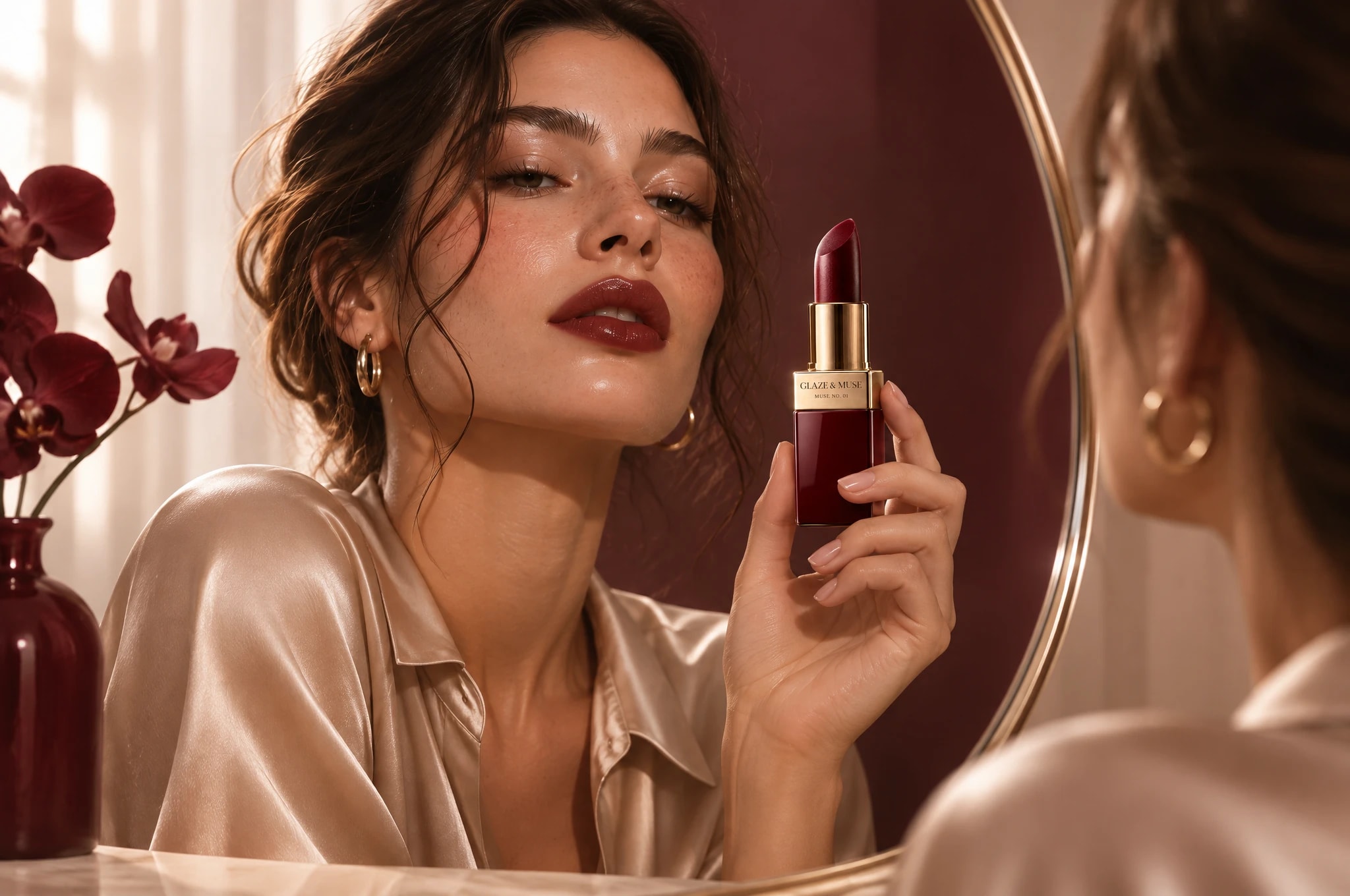
- The First Muse: a celebration of natural confidence, glow and self-expression. Dewy skin, soft cinematic light and rich burgundy and gold, with the lipstick treated as the muse's accessory rather than a product on a shelf.
- Approach
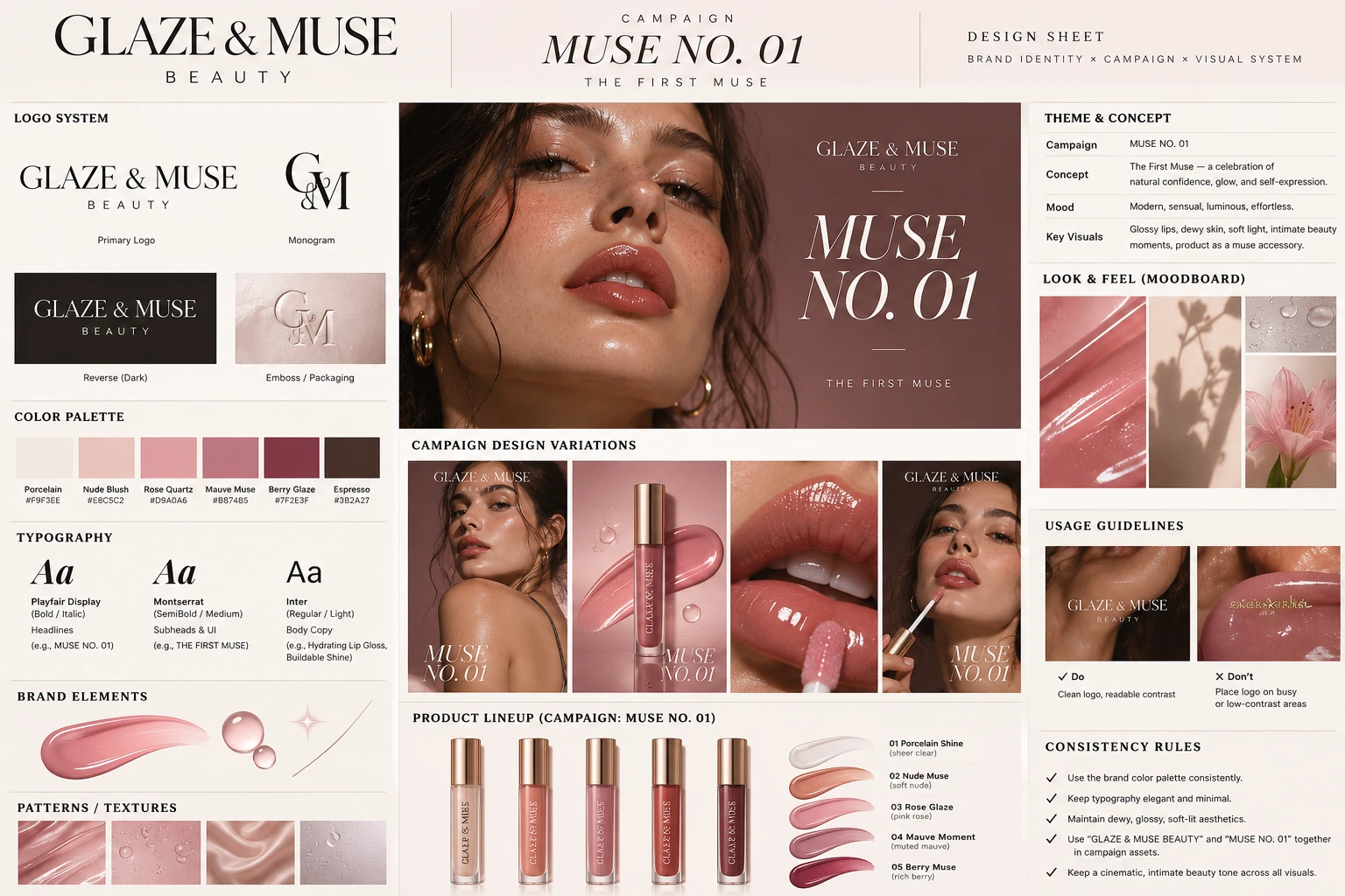
- We started with a design sheet: the logo system and monogram, a six-colour palette from Porcelain to Espresso, Playfair Display for headlines and Montserrat and Inter for supporting text. Every visual follows its rules: elegant, minimal type, a dewy, glossy, soft-lit look, and the logo only on clean, high-contrast areas. The visuals were made with AI image tools under our creative direction, then checked with attention tests.
- Deliverables
- Brand identity and logo system
- Campaign concept: Muse No. 01
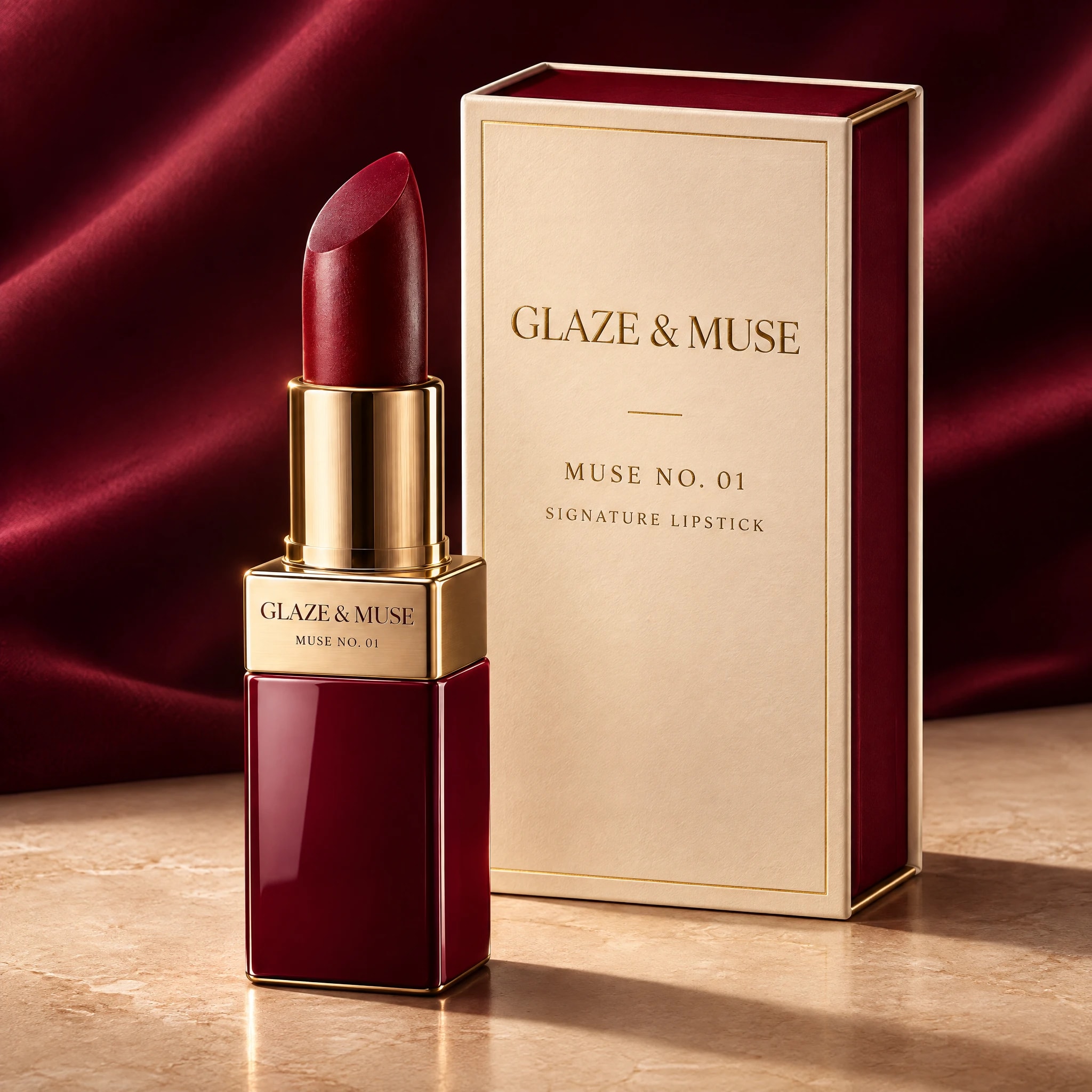
- Hero product visuals
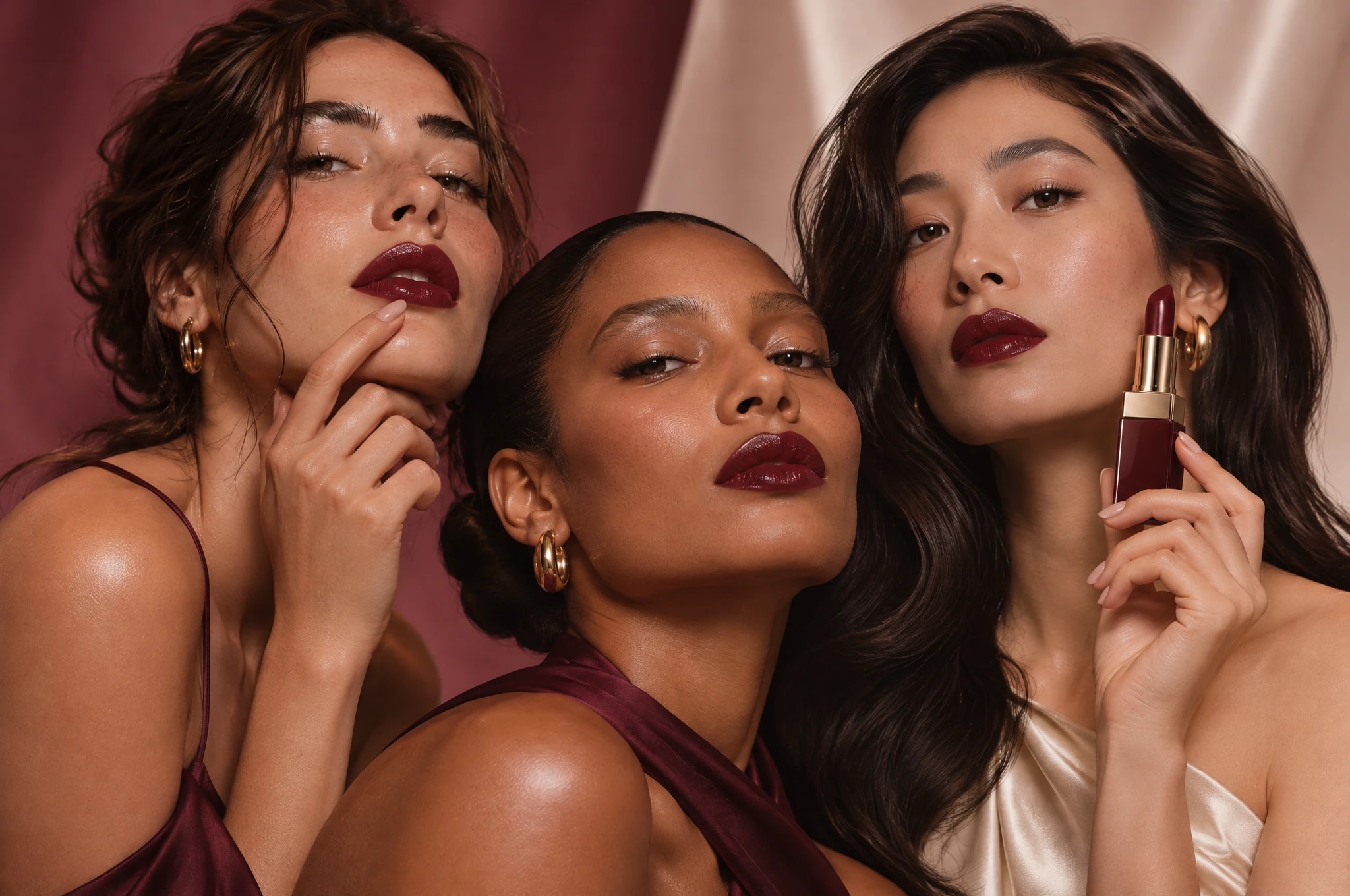
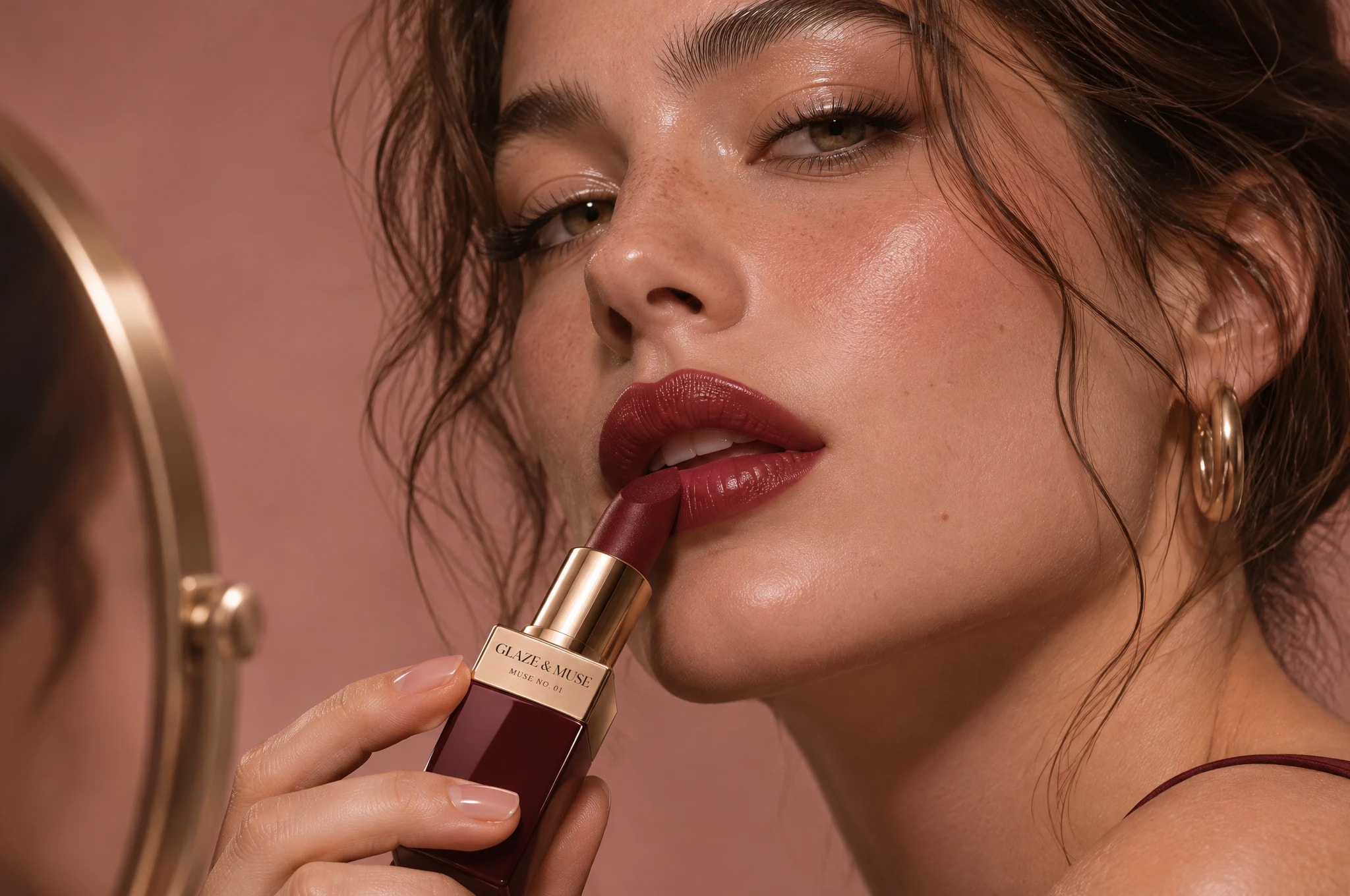
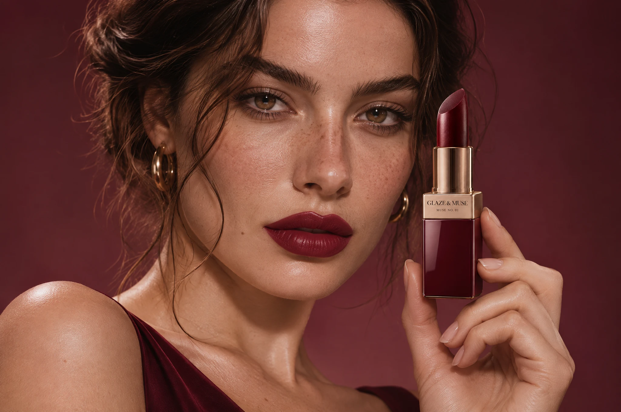
- Beauty portraits
- Packaging visual
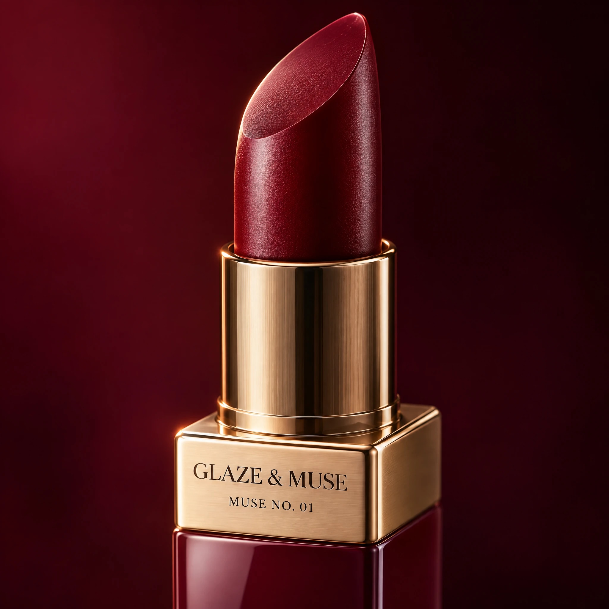
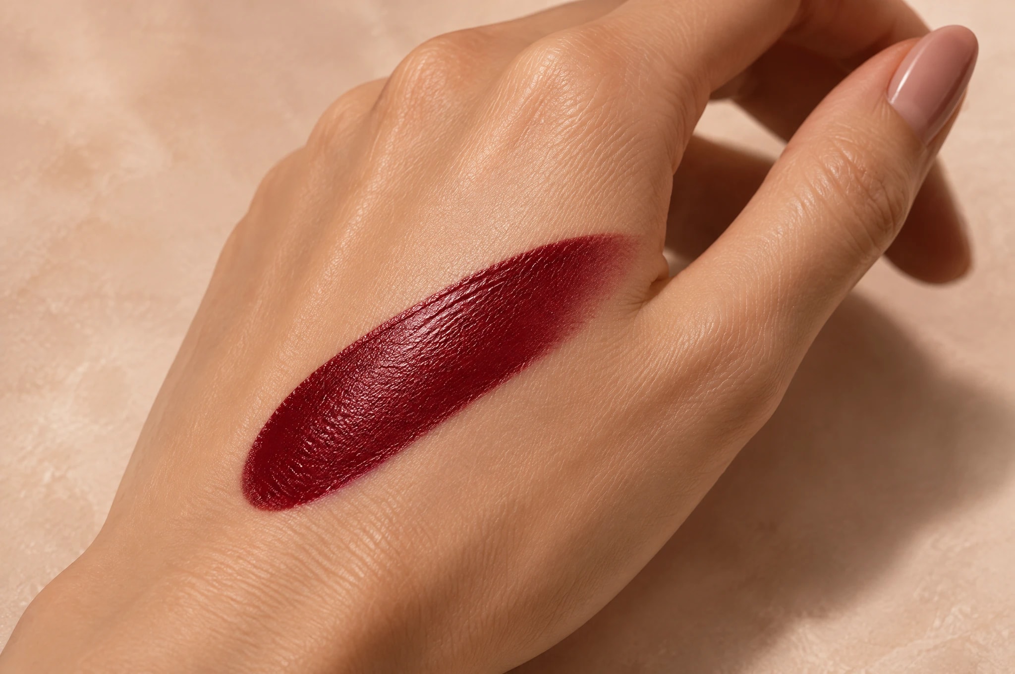
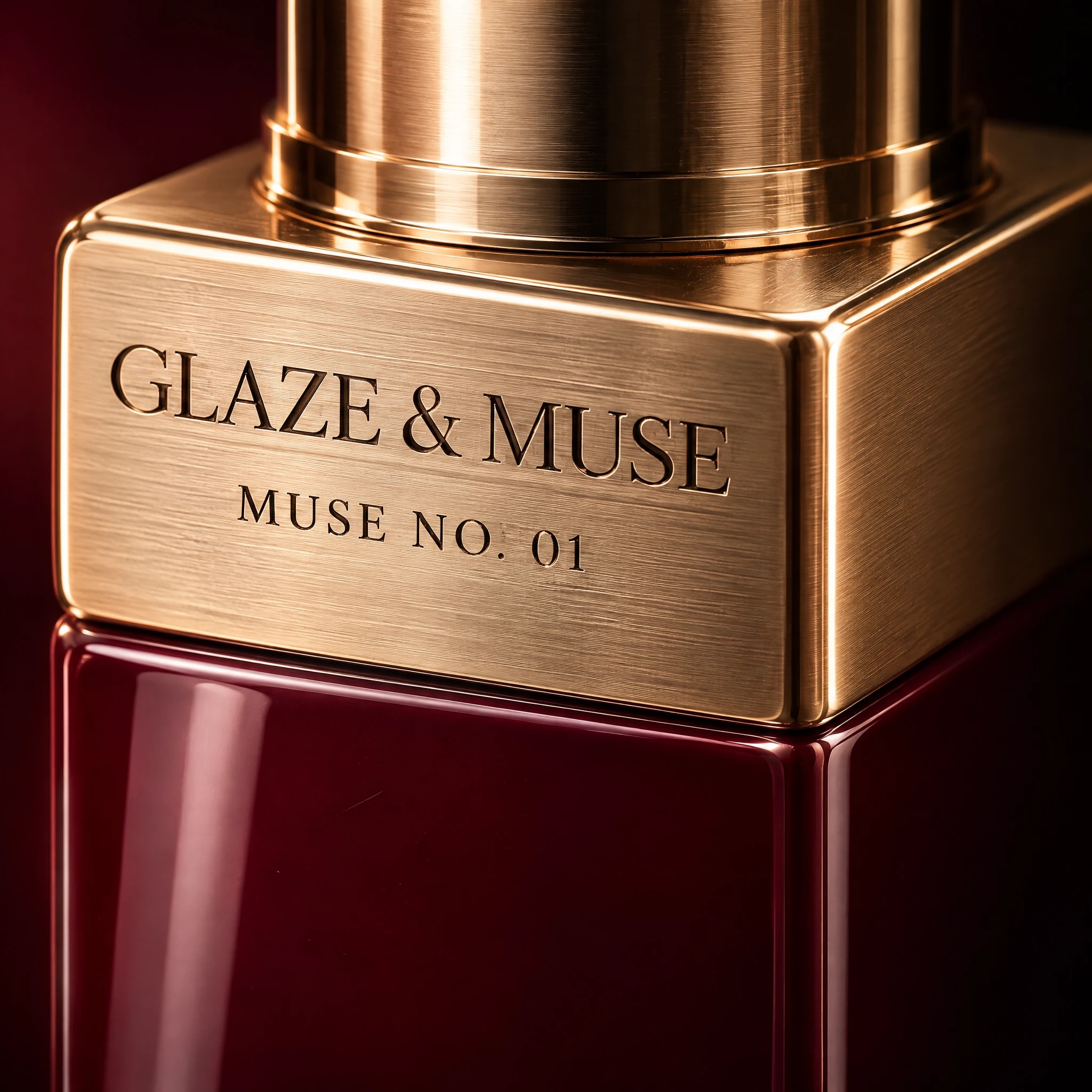
- Swatch and detail shots
- Design sheet and usage rules
12 visuals, one idea.
Product, portraits, packaging and detail shots, all built from the same palette, light and typography so the campaign is recognisable at a glance.
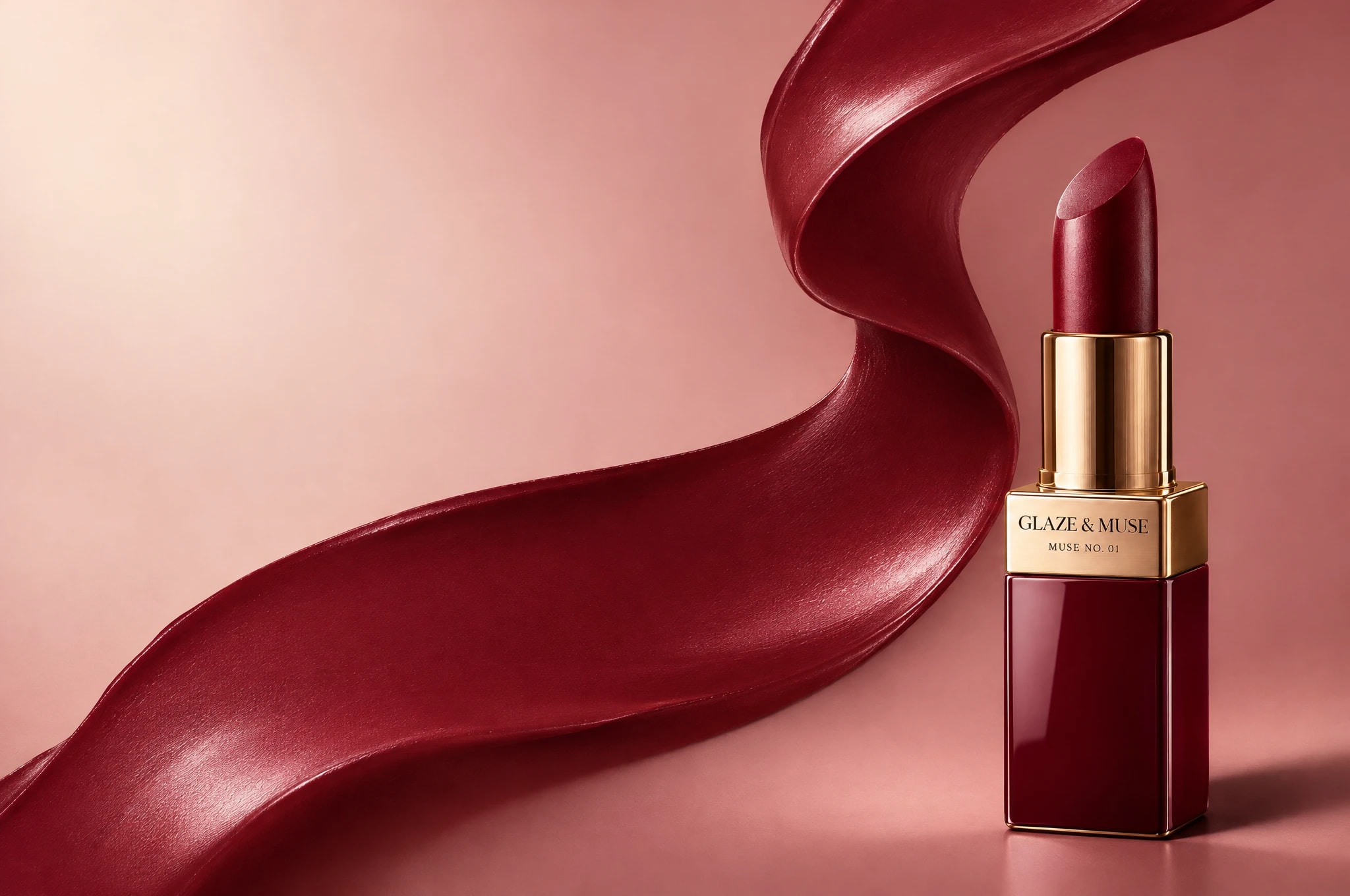
The rules behind every visual.
Before any image was made, we wrote the identity down: logo, colour, type and usage rules. That is what keeps a campaign consistent across every channel.
- Typeface
Playfair Display
Headlines, bold and italic
- Typeface
Montserrat
Subheads and UI, semibold and medium
- Typeface
Inter
Body copy, regular and light
How this visual is built to get seen first.
Where a project needs it, we check key visuals with these six attention checks. Here they are on this concept project.
Heat map
Where eyes land in the first seconds: lips, then lipstick, then eyes.
123Gaze order
What people see 1st, 2nd and 3rd, in the order we planned.
1 clear focusClarity score
One clear focus, not five fighting ones. Here: the lips.
Blur test
Blurred down, the lips still stands out.
Thumb-stop test
Shrunk to phone-feed size, it still reads and stops the scroll.
5s“A new burgundy lipstick, made to be worn.”Five-second test
After five seconds, people know what it's for: "A new burgundy lipstick, made to be worn."
Sample analysis to show the method. On client projects we run these checks with attention-prediction tools before anything goes live.